Collection · PL
How the Peso Was Born — Uruguay’s Hidden Masterpieces of Money
What did Uruguay’s money look like before it was money? Not the issued notes that passed through hands in Montevideo, but the photographic proofs and studio reference pieces that existed one step earlier: oversized, razor-sharp, and brutally honest about what the engravers actually cut into steel.
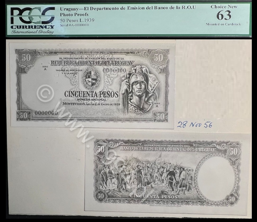
This Spotlight is built from an unusually complete run of Uruguay photo proofs spanning the full denomination ladder from 1 to 1,000 pesos, plus a large-format 1935 presentation mount that simply does not belong to the normal world of banknote-size paper. Together, these pieces let you read Uruguay's monetary identity as a system: how trust was designed, checked, approved, and scaled from everyday trade to state-level authority.
What this set is (and why it changes the conversation)
Most countries leave collectors with fragments: a single proof, a random remainder, a surviving issued note, and a lot of guesswork. This Uruguay group is different because it preserves the structure, not just objects.
- WHEN: late 1890s foundation material, then interwar redesign (1935), then the mature late-1930s program (1939).
- WHAT: photographic proof pairs (face and back) and large-format presentation mounts, preserved as working documentation rather than circulation artifacts.
- WHO: New York engraving culture (American Bank Note Company) meeting Uruguayan issuing authority, with London-era reference material (Bradbury, Wilkinson & Co.) showing a different portrait discipline.
- WHY IT MATTERS: the entire denomination ladder survives. You can follow the same visual trust logic step by step, from 1 peso to 1,000 pesos.
- HOW TO READ IT: as an approval workflow and an authority system, not as isolated collectibles.
The core idea
A banknote is not only a payment tool. It is an industrial document that must persuade multiple audiences at once: the public, merchants, state accountants, foreign counterparties, and the issuing institution itself. Photographic proofs sit at the point where persuasion becomes measurable. They are where designs are judged for clarity, hierarchy, legibility, and authority before currency enters the world and starts accumulating noise.
In Uruguay’s case, the proof material survives across every tier. That lets us study something most collectors can only assume: how a country engineered visual trust at different values, and how that engineering changed over time.
Two proof cultures: black-and-white vs sepia
Not all photographic proofs were meant for the same eyes.
- Black-and-white proofs are the clinical view. They emphasize structure: line weight, engraving depth, lettering sharpness, border integrity, and symmetry. This is the version that lets you detect whether a design will survive reduction to circulation size.
- Sepia proofs are the warmer, more presentation-oriented view. They often feel closer to a boardroom object than a workshop tool. The goal is not color simulation in a modern sense, but tonal comfort and a more "finished" photographic feel when a design is reviewed outside the engraver's bench environment.
Seeing both for the same denomination is rare. When it happens, it gives you a controlled comparison: the same design language, shown through two different approval lenses.
The denomination ladder as primary evidence
The strongest argument in this Spotlight is not "these are rare." It is that the ladder survives as a ladder. When you have proof material at 1, 5, 10, 50, 100, 500, and 1,000 pesos, you can test how authority scales: what gets simplified, what becomes monumental, what symbols repeat, what symbols disappear, and how the state chooses to look "inevitable" instead of merely "beautiful."
Below is an overview wall first, then the full illustrated sequence with enough context to read each piece as evidence.
The full denomination spectrum (1 to 1,000 pesos)
This overview is meant to show scale and coverage at a glance. The detailed sequence comes right after. Click any image to open its full Collection record.



How to read this Spotlight
The rest of the page is structured like a reference set, not a blog post:
- A short timeline table (so the structure is obvious).
- An illustrated sequence grouped by era (1896, transitional, 1935, 1939).
- Interpretation rules: what to look for in photographic proofs that you do not get from issued notes.
- A research agenda: the questions this material is designed to answer.
At a glance: the Uruguay proof timeline
| Era | What survives here | Why it matters |
|---|---|---|
| 1896 | Entry and mid-tier proofs (1, 5, 10) plus a high-tier 100, including both black-and-white and sepia presentation material. | Foundational design grammar: how a modern monetary face is established. |
| ca. 1900-1915 | A transitional 100 Pesos proof pair that bridges late-19th density and interwar restraint. | The missing link era most countries cannot show. |
| 1935 | A redesigned entry tier (1 Peso), a higher-value 100, and large-format presentation material at 1,000 (plus the high-tier 500 proof set within the broader collection). | Interwar modernization: geometry, monumentality, and cleaner authority signals. |
| 1939 | A mature unified program represented by 50, 100, 500, and a large-format 1,000 at the summit. | The late-1930s "finished voice" of Uruguayan monetary authority. |
Next comes the illustrated sequence. Each image links directly to its full Collection record, and each caption is written as a diagnostic note: what the piece tells you and what to look for.
Illustrated sequence: 1896 foundation proofs
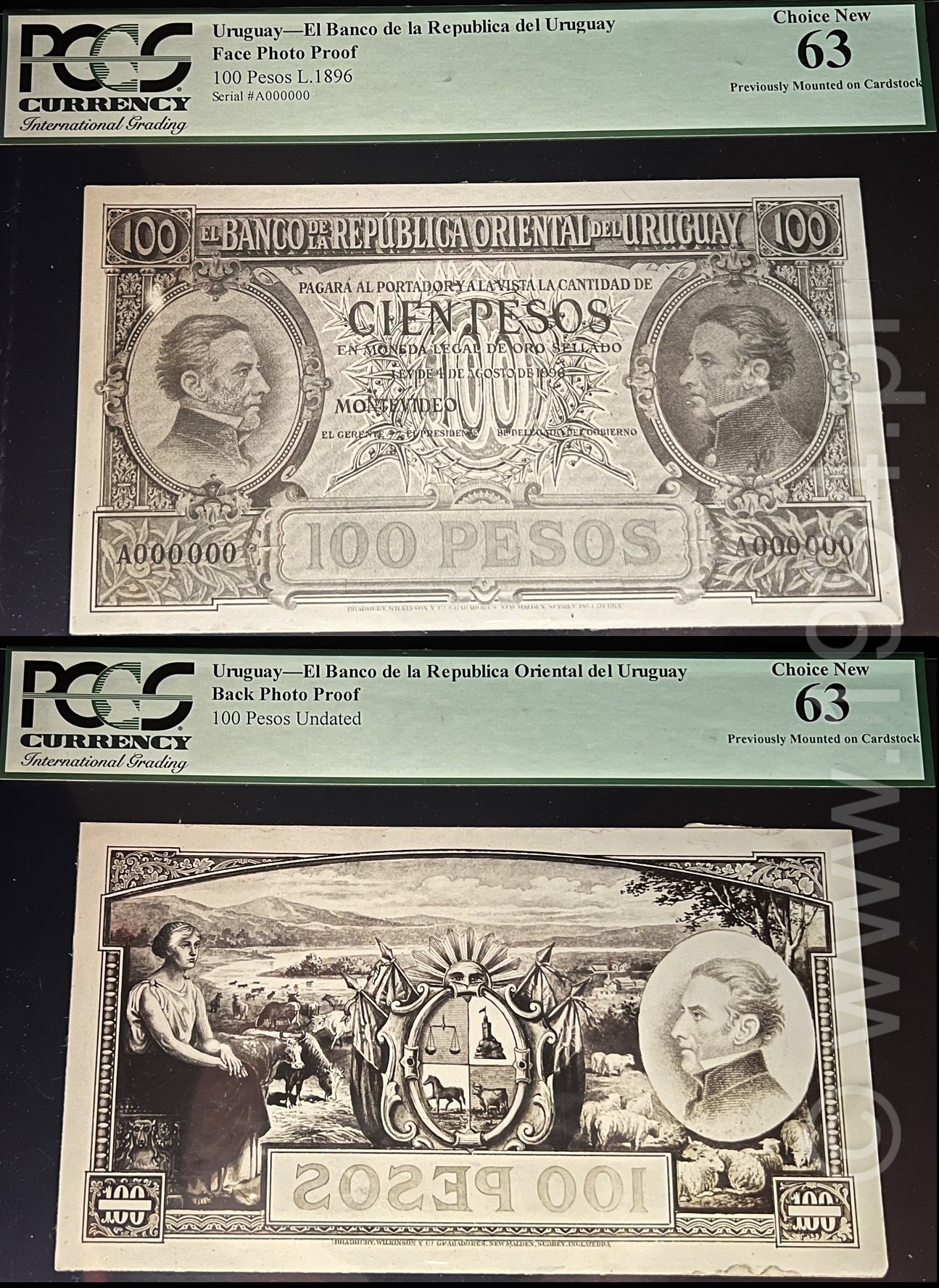
The 1896 material shows how Uruguay chose to look "bankable" at birth: dense guilloche, formal portrait authority, and a visual vocabulary designed to read as secure even before you understand the language. This is the late-19th-century international banknote dialect, localized for Uruguay.
Start here because it forces the key question: how does a state ask ordinary people to trust paper at the smallest unit? The answer is not "simplicity." It is controlled density: enough guilloche and frame structure to signal security, but not so much that the denomination loses immediate readability. Sepia format matters because it reads like an office object, not a workshop artifact. It feels like something shown to decision-makers.
The 5 Pesos tier is where banknotes stop being symbolic and start being operational: frequent handling, repeated verification by merchants, and the need to look legitimate quickly. In proof form, you can see the design prioritize structure: border integrity, portrait anchoring, and a frame that reads as "engineered" rather than decorative. This is also where the late-19th ABNC visual language hits its most functional balance.
The 10 Pesos sits at the bridge between everyday circulation and serious commerce. What changes is emphasis: the design begins to communicate external legitimacy. This is where ports, trade scenes, and national positioning matter. In black-and-white proof, the harbor or civic vignette reads like an argument: Uruguay is connected, stable, and readable to outsiders.

This is the control comparison: the same denomination filtered through a different approval mood. Sepia shifts perception. The design feels less like a technical diagram and more like an object of authority. For research, this matters because it separates "engraver readability" from "executive acceptability."
High denominations are not designed primarily for circulation convenience. They are designed to anchor the system. This is where the note stops talking to buyers and starts talking to bankers. In proof form, the hierarchy becomes clear: portrait authority, frame discipline, and a composition that feels closer to a certificate than a receipt.
The face behind the faces: a London-era portrait reference
One piece sits slightly outside the Uruguay proof ladder but explains it: the Artigas portrait die proof by Bradbury, Wilkinson & Co. If ABNC represents a late-19th New York security-printing dialect, Bradbury represents a London portrait discipline that often feels calmer, more photographic, and less heroic in its engraving psychology.
See the Artigas die proof (Bradbury, Wilkinson & Co.)
The missing-link era: a transitional 100 Pesos proof (ca. 1900-1915)
This is the kind of evidence most countries cannot show: an intermediate proof pair that does not look fully "1896" and does not yet look fully "1935." Transitional material is how you prove that design evolution was a process, not a jump cut.

Transitional proofs are research gold because they show where a printer or issuer starts pruning ornament and rebalancing hierarchy. Look for what gets quieter (some decorative density) and what stays loud (portrait authority and denomination clarity). This piece is not just rare; it is diagnostic.
Interwar redesign: 1935 proofs and large-format authority
By 1935, the design language shifts. The message is still "trust us," but the delivery is more modern: cleaner geometry, more monumental allegory, and a different kind of seriousness. The key change is not that the designs become simpler. It is that they become more controlled.

Compare this directly to 1896 1 Peso: the authority is less ornamental and more structural. The frame feels engineered. Allegory becomes more declarative. The note looks like it belongs to an institution that expects to remain. This is what interwar security aesthetics look like when translated into daily money.
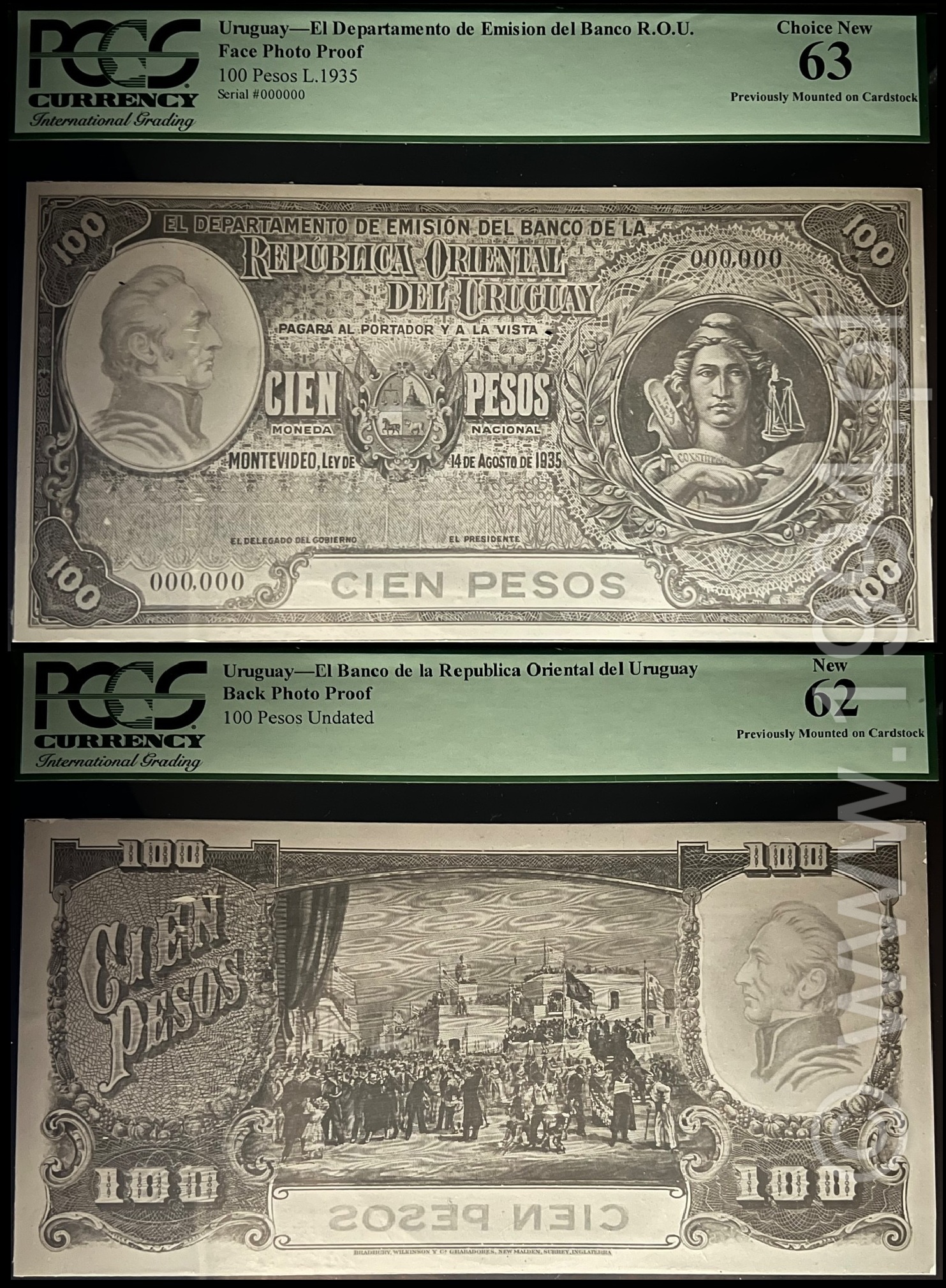
The 100 Pesos tier is where the state stops merely "being present" and starts declaring institutional values. Look at how allegory is used: less romantic, more administrative. In proof form, you can judge whether the engraving hierarchy works: portraits, titles, arms, and denomination all occupy stable, controlled positions.
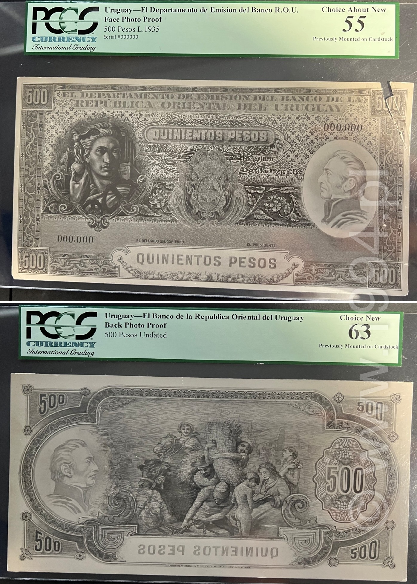
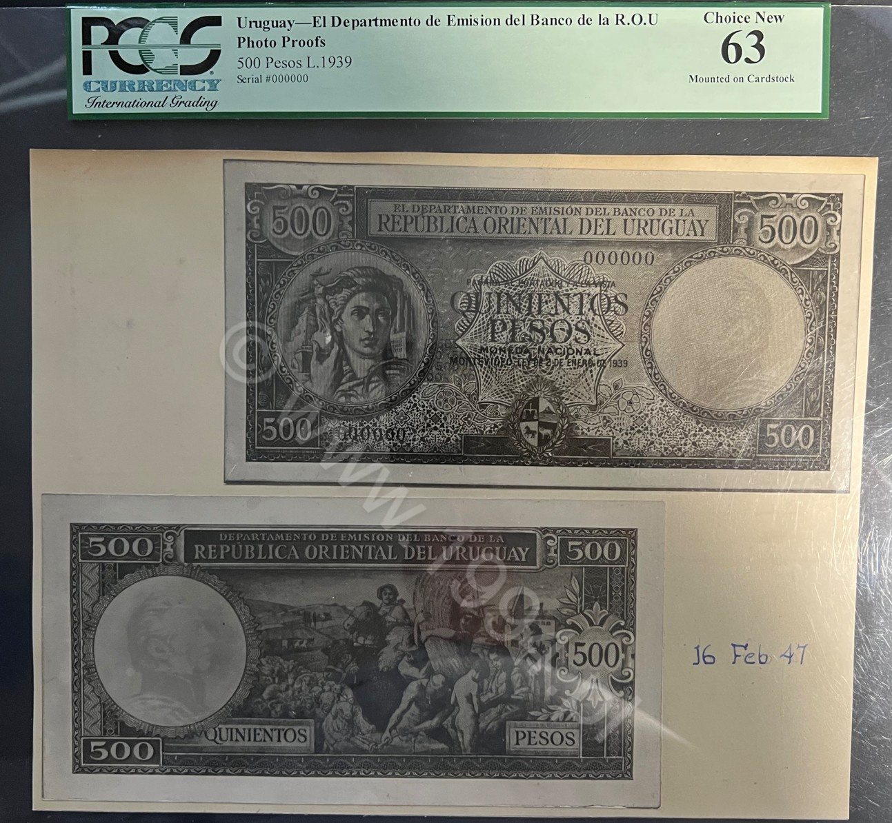
Large-format proofs are not just "bigger photos." They are a different kind of object. The enlargement makes engraving decisions visible: how shadows are modeled, how hair and fabric are built line by line, how frames transition without breaking. At 500 Pesos, Uruguay is speaking to institutions. The design is meant to feel unarguable.
This is the shock piece: not only the highest denomination, but preserved on an oversized presentation mount that turns a banknote design into a wall-scale document. The point of this format is viewing, judging, approving, and archiving. It is authority evaluated as an object. If you want to understand what the issuing authority wanted to project at maximum value, this is where to look.
Mature program: 1939 proofs (50, 100, 500, 1,000)
By 1939 the language looks settled: the hierarchy is stable, the allegory is controlled, and the designs feel like parts of a single state system rather than separate artistic projects. This is where a "series voice" becomes obvious.
This is where the series becomes self-consistent. The note has a clear hierarchy, clean margins, and controlled ornament. Compare to 1896: you can feel the shift from decorative security to structural security. The proof format is ideal for judging balance and legibility without color distraction.
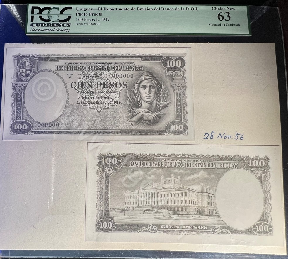
On higher tiers, modern states love architecture because it implies permanence. In a proof, architectural engraving also proves competence: straight lines, perspective, and fine shadow work are not forgiving. This is a perfect example of how "security" becomes visual discipline, not ornament.
500 Pesos is a psychological denomination: it is not meant to circulate like small money. It exists to make the system feel rich, competent, and sovereign. In proof form, the Liberty head becomes a technical object: you can see the exact line logic that produces facial modeling and depth without color.
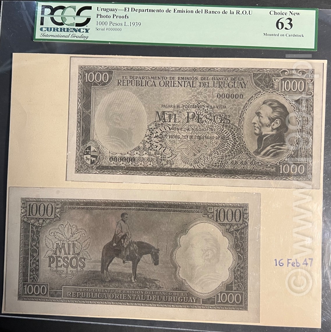
The 1,000 Pesos tier is the point where money behaves like a declaration. Large-format presentation proofs expose everything: portrait modeling, frame decisions, spacing discipline, and whether the whole composition holds under prolonged viewing. This is where "beautiful" is irrelevant. The only question is: does it feel inevitable.
How photographic proofs were made (and what survives in them)
Photographic proofs are not simply "photos of banknotes." They are workflow objects. They preserve:
- Hierarchy decisions: what the eye is forced to read first (denomination, issuer, portrait, arms, vignette).
- Engraving logic: how shadows are built, how borders interlock, how guilloche fields are balanced.
- Approval intent: whether a piece was workshop-oriented (clinical contrast) or presentation-oriented (sepia warmth, mount emphasis).
- Scale truth: what the design looks like when not compressed into circulation size.
This is why proof material can be more educational than issued notes. Issued notes are the public output. Proofs are the decision record.
What the full ladder tells us (beyond "rare proofs")
With the pieces shown together, the important point is not that Uruguay had foreign printers or strong engravers. Many countries did. The important point is that the same trust logic scales across values and changes cleanly across decades.
- Authority is modular. The state does not reinvent itself at each denomination; it repeats the same authority markers with different emphasis.
- Design density is not decoration. In 1896, density functions as security theater and legitimacy theater at the same time.
- Interwar style is control. By 1935 and 1939, the designs feel less ornamental because the institution wants to look stable, not merely sophisticated.
- Large-format mounts are workflow artifacts. They exist because someone needed a design to be judged as an object, not merely printed as a note.
Research questions this Spotlight is designed to answer
- How does a country scale visual authority? Compare 1 Peso vs 1,000 Pesos within the same era.
- Where does the design language actually change? Use the transitional 100 Pesos as the bridge evidence.
- What is repeated across decades? Portrait centrality, arms placement, border discipline, and the way allegory replaces ornament.
- What is the function of sepia variants? Treat them as a separate approval culture, not merely an aesthetic curiosity.
Looking ahead
This Spotlight focuses on proof material and the design/approval record. A separate piece can go deeper into the 1939 standardized specimen era and how that program behaves as a full issuing system rather than a set of proofs.