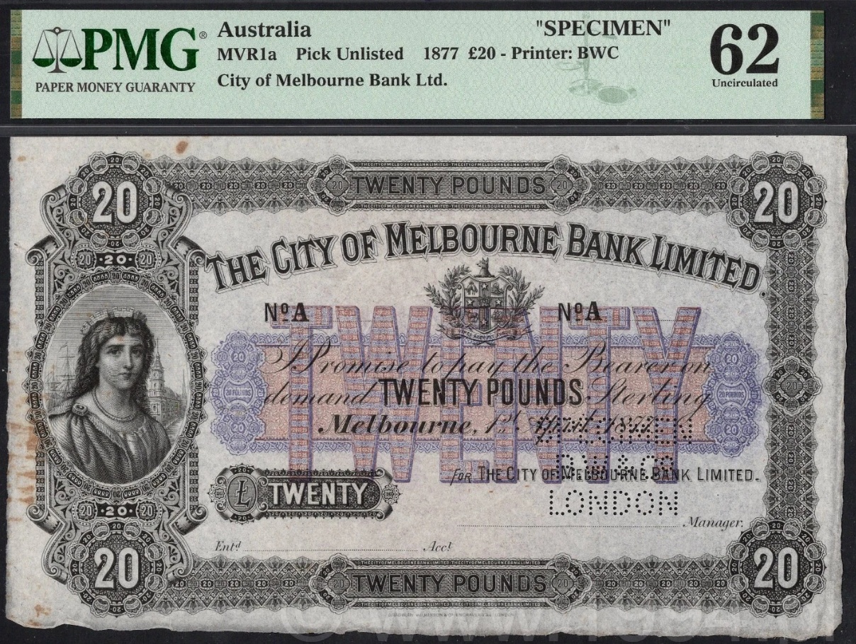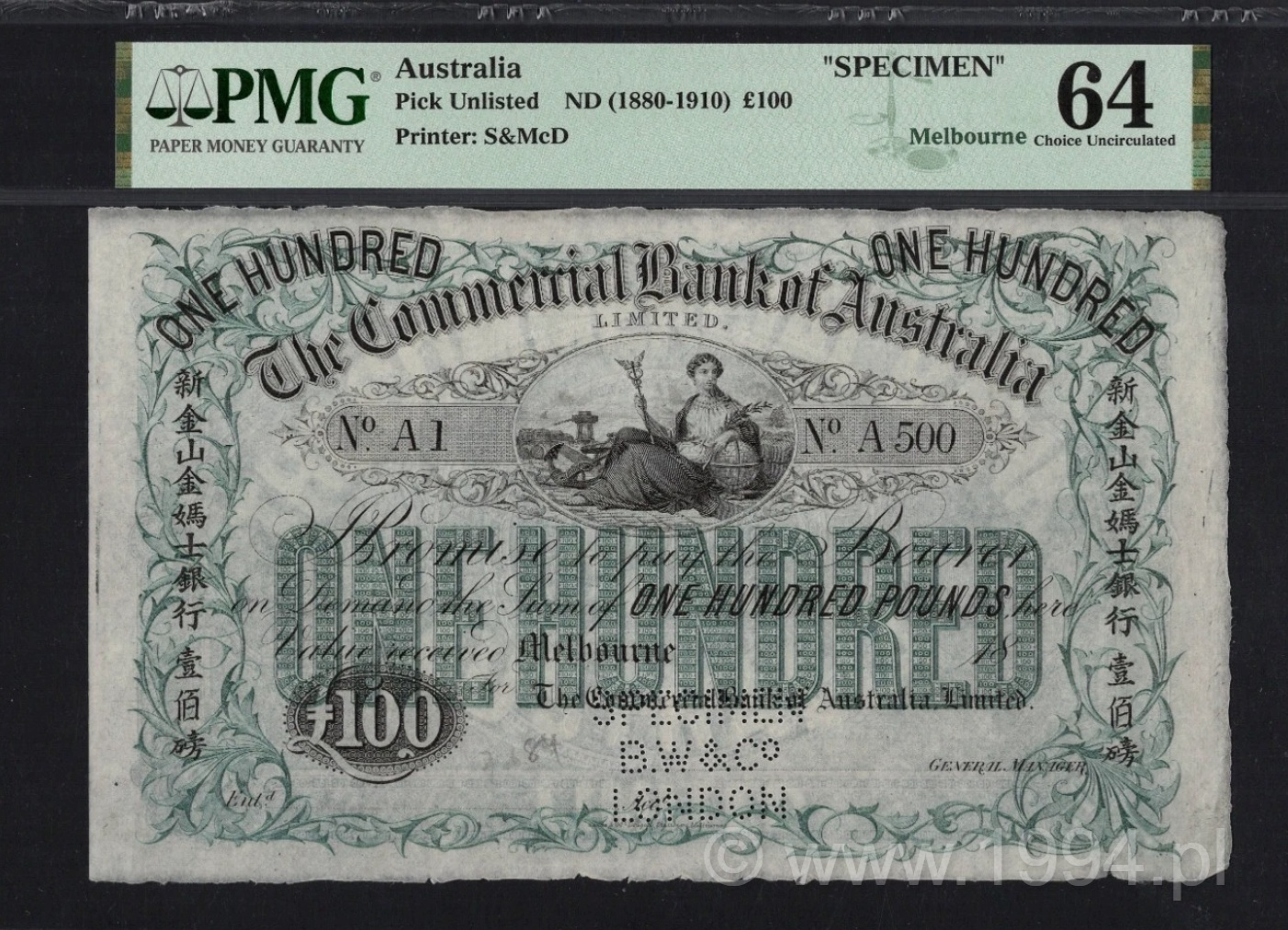
Engraved by Bradbury, Wilkinson & Co. in London and printed locally by Sands & McDougall in Melbourne, the note embodies the cooperative evolution of Australian banknote production. Bradbury, Wilkinson supplied the master plates, security devices, and engraving framework, while Sands & McDougall executed local printing to supply the bank's circulation demands across Victoria and the wider Australian colonies. The imprint 'Bradbury, Wilkinson & Co., Engravers, London' confirms its master-plate origin, while the local printer’s marks establish the dual-track production typical of the late colonial banking era.
The £20 denomination occupied the highest settlement tier within the BNZ system and was deliberately executed in a blue–slate color family reserved for upper-level clearing and interbank instruments. This chromatic choice followed Bradbury Wilkinson’s established BNZ color logic, progressing from £1 Green through £5 Red and £10 Brown to the subdued blue tones of the £20, visually signaling professional handling and high-value usage.
The engraving is a characteristic example of Bradbury Wilkinson’s late Victorian security printing: a bold central title cartouche, finely balanced allegorical figures symbolizing commerce and navigation, and dense lathe-work designed to defeat contemporary counterfeiting. These elements were not decorative excess, but functional security features exported from London to colonial issuers seeking credibility and trust in rapidly expanding financial markets.
The portrait is presented within a narrow oval composition and depicts a young woman in three-quarter view, wearing a decorative head ornament and draped garment, with architectural detail visible in the background. The engraving is built from fine intaglio linework, controlled cross-hatching and carefully graduated tonal transitions, with particular attention given to the face, hair, clothing and background.