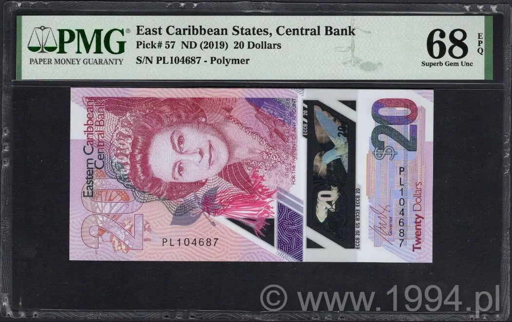
East Caribbean States 2019 - Central Bank 20 Dollars (Pick 57)
Issued polymer 20 Dollars from the East Caribbean Central Bank, dated 2019 and catalogued as Pick 57. Read more →
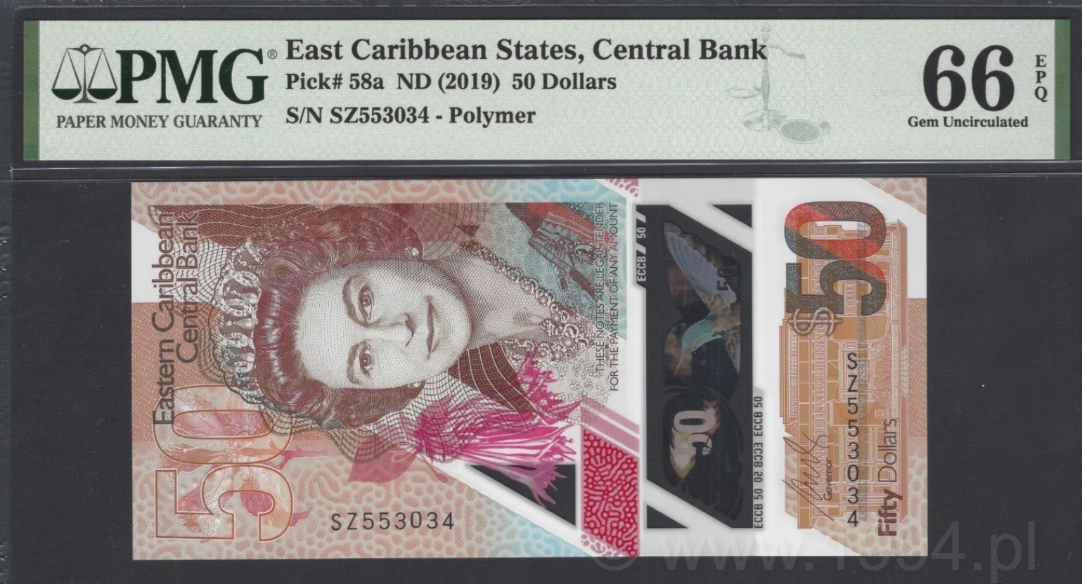
First polymer 50 Dollars issue of the East Caribbean Central Bank, released in 2019 and printed by De La Rue. Initially unlisted in the SCWPM, it was later recognized and catalogued as Pick 58a. This early production note carries the same design elements later standardized across the denomination series. Read more →
Issued polymer 50 Dollars from the East Caribbean Central Bank, dated 2019 and catalogued as Pick 58a. Printed by De La Rue, it represents the official polymer debut of the highest denomination in the ECCB currency series. Read more →
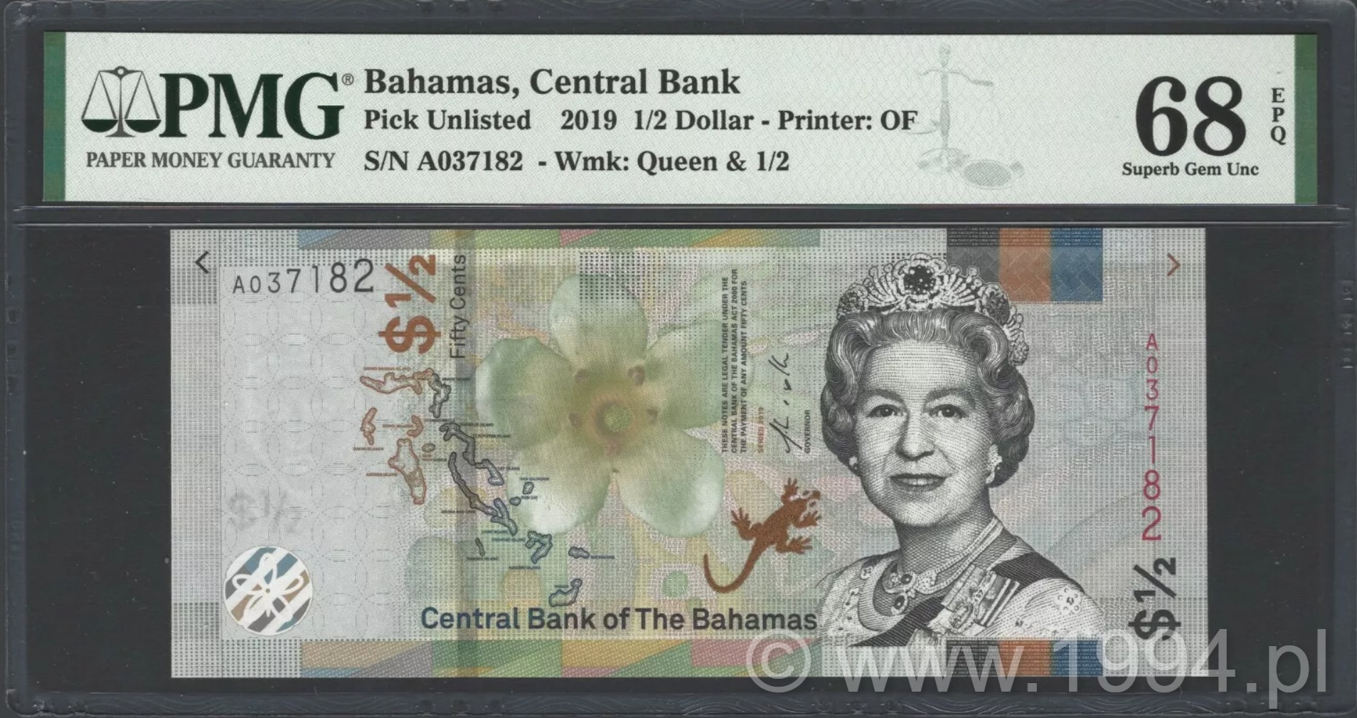
Issued half-dollar from the Central Bank of the Bahamas, first recorded by PMG as Pick Unlisted prior to its formal inclusion in the Pick catalogue. Printed by Oberthur Fiduciaire, this note carries the watermark of Queen Elizabeth II alongside the denomination '1/2', consistent with the broader CRISP Evolution Series launched in 2019. Read more →
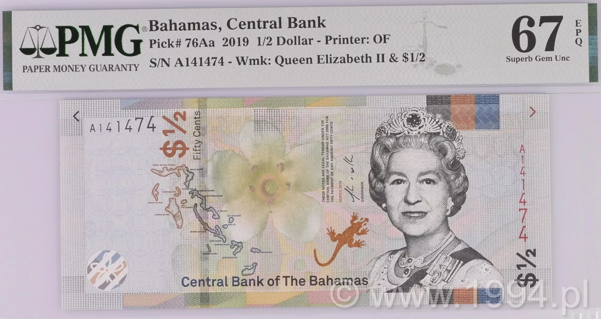
The 2019 CRISP Evolution release consolidated earlier printings that had circulated under provisional catalog numbers, such as the prior 'Pick Unlisted' entry now formalized as 76Aa. The Central Bank’s initiative emphasized secure yet visually distinctive design, blending traditional Caribbean color palettes with the technical expertise of European security printers. Read more →
Mounted on original cardstock, the piece reflects standard archival handling for internal review materials within the production process. Such proofs were not intended for distribution and were typically discarded after approval stages were completed. Read more →
The reverse design features a detailed architectural cityscape of Luxembourg, framed within a structured ornamental border. The monochrome format allows clear assessment of tonal hierarchy, perspective depth, and the relationship between central imagery and denomination markers. Every element is presented in its finalized positional form, confirming that the design had reached full compositional maturity at this stage. Read more →
The green 10 Centesimos served as the lower denomination of a two-note series alongside a brown 20 Centesimos. Both were produced in bound counterfoil books, as shown by the wide left margin and binding perforations. Design: single-sided green lithograph with an agricultural harvest scene of field workers cutting and binding grain. The legend DIEZ CENTESIMOS sits in ornate rosettes marked 10, with the Bauer imprint at base. The N in the printed word Numero appears reversed, a minor plate flaw noted in contemporary descriptions. Some examples are known with an oval back stamp reading JABONERIA DE PABLO VALDEZ TACUAREMBO. Read more →
Design: single-sided brown lithograph with a neoclassical vignette of two youths carrying a sickle and sheaf of grain, symbolizing cooperation and labor. The value VEINTE CENTESIMOS appears within rosettes marked 20; the Bauer imprint sits at base. The wide left margin and binding perforations show that these were bound in counterfoil books for controlled issue. The note measures roughly 141 by 57 mm, matching the size data preserved in Uruguayan references. Read more →
Historically, this specimen represents the final appearance of the pre-robbery layout: De La Rue’s guilloché and microtext design with latent numerals, holographic foil stripe, and complex underprint-hallmarks of early twenty-first-century security printing. Survivors are scarce and serve as reference material for the transition between the withdrawn 2004 and the replacement 2005 series. Graded PMG 63 Choice Uncirculated. Read more →
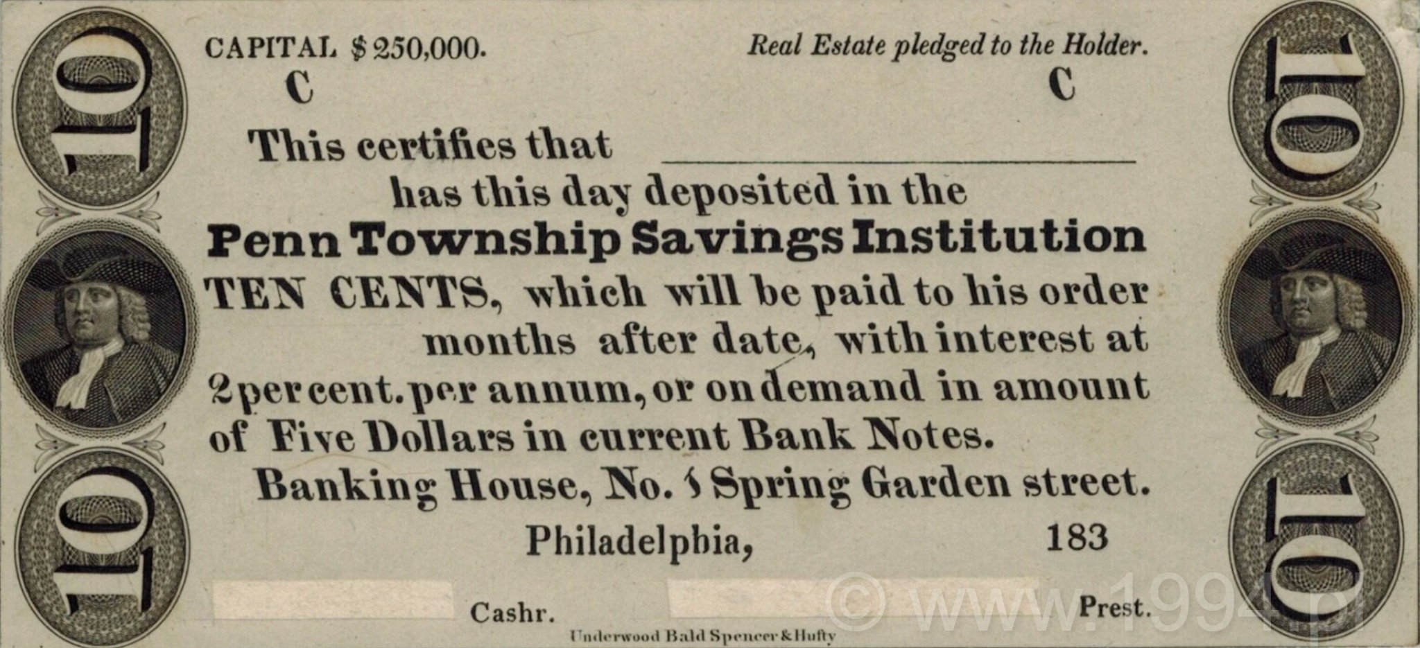
The engraving was executed by the Philadelphia firm Underwood, Bald, Spencer & Hufty, one of the prominent American security printers active before the later consolidation of major banknote engravers into the American Bank Note Company. Their work here demonstrates the refined steel engraving style characteristic of pre-Civil War American security printing, combining strong typographic layout with finely executed portrait vignettes. Read more →
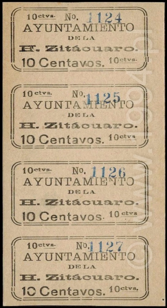
Printed four-up on thin local stock, the sheet reveals the original production layout intended for manual cutting prior to circulation. Most surviving examples of Zitácuaro municipal notes were separated for use during the revolution, making intact sheets exceptionally scarce. The preserved format here documents both the numbering sequence and the municipal printing method employed in Michoacán’s revolutionary economy. Read more →